Creating An Identity System For Obsidian Bodyworks Therapeutic Massage in Salem, Oregon
Getting off to the right start as she opens her new massage therapy practice is important for Caitlin at Obsidian Bodyworks. In addition to her certifications as a licensed massage therapist, and getting the business side of things organized, she knows that putting her business in front people in a recognizable way is important.
We spent time with Caitlin discussing what she wanted people to know about her business. With a focus on healing and pain relief it is important that Obsidian Bodyworks presents a competent and therapeutic image. She also wanted an image that portrayed relaxation and healing without becoming too feminine or “spa-like”—a rather fine line to navigate!
Obsidian represents the elements of fire, earth, and water and is used by spiritual healers to break negative attachments and shield against disharmony. Using the unique conchoidal fracture pattern of obsidian seemed like a natural starting point and the logo came together rather quickly.
![]()
Obsidian Bodyworks Therapeutic Massage in Salem Oregon
But of course, the logo is only the beginning of an image for any business. Integrating colors and fonts start to give a more complete visual personality to Obsidian Bodyworks.
Using black to give a sense of strength seemed like an obvious choice. Adding green to show new beginnings and growth, along with its balancing and harmonizing effect, presents a very stable image, and purple adds a calming influence of dependability and integrity.
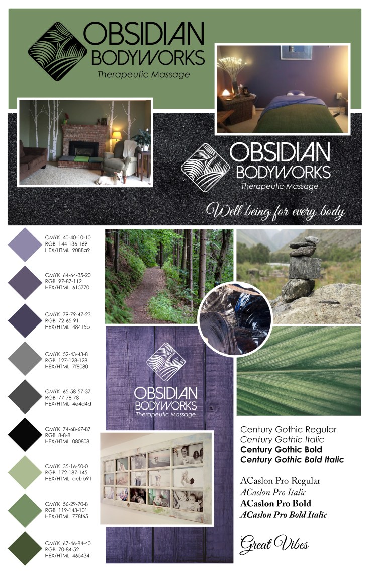
Photography is an important element of presenting therapeutic massage correctly, and thanks to the amazing Kelvin Watkins we have photos which portray therapeutic massage done correctly, along with maintaining visual standards for Obsidian Bodyworks.


Once all the elements came together we collaborated with Lewis Media Group and they put together a website which clearly communicates what potential clients need to know.


Leave a comment