
What does rebranding consist of? When should it be considered? How is it accomplished? When Cascade Balanced Books approached me about a new logo, it quickly became apparent that they needed to update their entire image. New ownership of the business and their desire to reach out to some new markets made this an ideal time for them to rebrand. Cascade Balanced Books is a full service bookkeeper providing reconciliations, bill pay, AR, AP, budgeting, financial statements, data entry, payroll, payroll taxes and other tax filings. They specialize in small to medium sized businesses and also do personal bookkeeping to help individuals with budgeting, bill payment, and reconciliations.
Of course branding isn’t about your company—it’s about your customers. It doesn’t matter if you and your staff love your new logo if your customers hate it or it doesn’t resonate with them. It doesn’t matter if your best friend or your nephew drew it. Your logo and name must make sense and be appealing to your customer base. If your customers don’t understand your message, it’s not serving a purpose.
They were represented by a line logo of mountains—or possibly trees—meant to symbolize “cascading” or “stepping to greater heights.” The website, on the other hand, presented the word “Cascade” with an image of a mountain range pasted into it. Subsequent images on the website were indicative of Oregon nature or Cascadia, but did not necessarily represent financial services. The effect of the nature images and quotes was rather generic. Each page had a quote meant to inspire confidence, and while this was reassuring in a calming, nature orientated kind of way, I felt their business would be better represented with a brand which communicates those concepts visually—by a logo and branding which could be extended to all the visual communication of the company.
The former logo:
![]()
And the website, which presented an entirely different look:
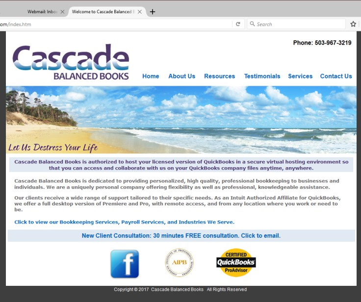
Without coherence their message was diluted. People are influenced by what they see and the power of imagery is extremely effective in creating a comprehensive brand identity that customers will recognize and remember.
There was no brand recognition because there was no branding. Luckily Cascade Balanced Books realized that each impression counts and that as they moved forward they needed to present a stable brand.
When describing what they were looking for in a logo they expressed an inclination toward Kelly green, with an Oregon silhouette and a gradient, along with their stated goals of communicating the concepts of “professional, reliable, easy to work with, bringing financial order and peace of mind, flexibility, knowledgeable assistance, convenience, efficiency, and de-stress.”
My initial research into Cascade Balanced Books’ competitors found many small local bookkeepers without any sophisticated branding. I found a lot of clip art and bad typography, along with interesting color choices. There are butterflies, fruit, and a LOT of trees, and not much that identifies any of them as financial professionals. I think this is mostly DIY stuff, and the result of <poor> budgeting choices and personal preferences. Purple butterflies, anyone?
Of course branding isn’t about your company—it’s about your customers. It doesn’t matter if you and your staff love your new logo if your customers hate it or it doesn’t resonate with them. It doesn’t matter if your best friend or your nephew drew it. Your logo and name must make sense and be appealing to your customer base. If your customers don’t understand your message, it’s not serving a purpose.
Adding accountants and other financial services to the market research yielded businesses who had put more thought into their branding. Below are a couple of examples of excellent logotype. Note the blue for loyalty and reliability.
![]()
![]()
Other images I found which—while not competitors—could possibly confuse the brand:


There were also a couple of “Cascades” brands which needed to be considered:
![]()
I knew that green would be a good choice in the branding as it suggests an association with prosperity and abundance, and darker greens in particular can represent financial companies because they are associated with wealth or prestige, and can remind consumers of money. However, there is also a strong association with nature. Green is thought to promote a sense of health and healing and is often associated with the environment and the promotion of natural or dependable products.
A green logo can convey the message that a company is environmentally friendly. This is why it is popular with organic and vegetarian brands, as well as companies that strive for ethical practices.
An early exploration of some mountain and tree shapes, along with the State of Oregon shape quickly revealed the concept to be too “nature” oriented to represent Cascade Balanced Books accurately:
However, further exploration of the triangle shapes provided some direction. I also briefly explored a ledger sheet, along with some color variations.
![]() Eventually one of those images emerged with the potential to stand on its own.
Eventually one of those images emerged with the potential to stand on its own.

The overall rectangular shape of the new logo is a very stable, reliable shape, tempered with the diagonal lines of a triangle to indicate energy, vitality, and balance. See what I did there? The repeated triangle shapes within the triangle strengthen the dynamic impact of the logo.

“Your friendly bookkeeping and payroll experts.”
The choice of a warm, modern, fresh green, supports the trustworthiness of the image, and inserts a reassuring contemporary tone into the brand. Deep violet blue as a supporting color adds the calming influence of dependability and loyalty, while the rich terra-cotta brown accent color helps to ground the primary color—both colors adding credibility to the overall strength of the visual identity.
“LouJean produced an entirely new brand for Cascade Balanced Books, a new logo, all new printed materials and she brokered all of the printing. Our new look is soon to be officially unveiled. She is amazing to work with, very organized, and she is a truly gifted graphic designer!”
Michelle Blumenthal, Cascade Balanced Books
Additional branding elements include the readily available typefaces of Ariel and Minion for written communication. Typography, while not always recognized as an identifying element of your business by consumers, definitely communicates the wrong message if done poorly or inconsistently.
Imagery is also extremely important in communicating how you want to be seen. Images chosen for both print and digital applications reflect Cascade Balanced Books’ brand as a professional and ethical woman owned business in the Salem business community. The reliability, efficiency, and accuracy of the company are evidenced in the images chosen to represent the company. Images depicting strong, professional women in a business setting help Cascade Balanced Books communicate its place as a leader in bookkeeping services for business in Oregon and beyond.
![]()
Just a note on imagery:* Care has been taken to ensure that any images depicting people, an office setting, or office papers or equipment, are neat and professional in appearance. Images that communicate disarray or frustration—even in an attempt to portray Cascade Balanced Books as the remedy to these problems—will instead communicate disorganization and an unprofessional image.
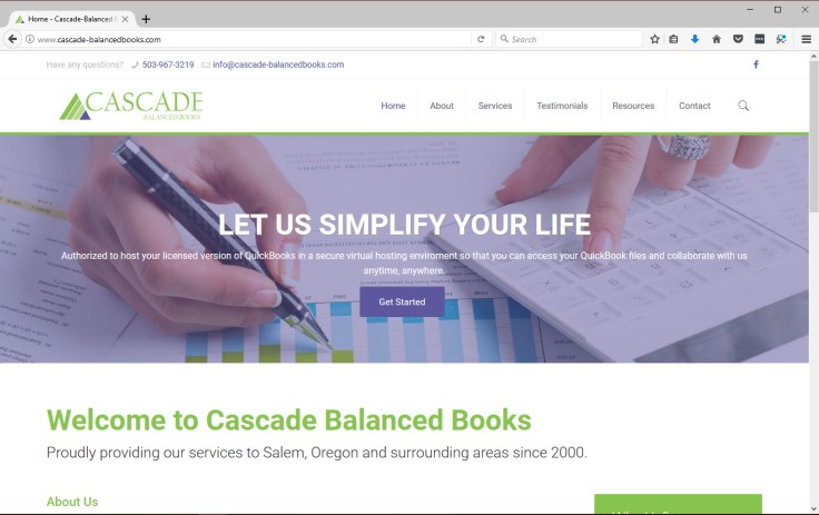
Branding guidelines were written for the company to use to ensure that all the visual communications remain intact. They were also used by the website designer to create a brand new website for the company which presents a cohesive look and leaves no doubt in customer’s minds where they are.
If you think it might be time for a facelift for your visual communications give me a call. I can guide you through the questions to determine if you need a new brand, a rebrand, or an update.
LouJean Fobert Graphic Design, Salem, Oregon

Leave a comment